Avoiding Common Mistakes in Interior Design presentations are of utmost importance in the field of interior design. A skillfully executed presentation has the potential to elevate a mediocre project to new heights, whereas a poorly executed one can spell disaster, regardless of the designer’s expertise and background. Continue reading to discover the five critical errors in design presentations that can undermine all the hard work.
In 3D Interior Design Presentations, avoiding certain mistakes can significantly enhance the effectiveness of your communication with clients.
Step-by-Step Guide to Perfect Interior Design Presentations
Insufficiently prepared speech
Despite its evident significance, the preparation of a presentation is frequently disregarded. Indeed, you have dedicated numerous days (and perhaps even nights) to developing the design concept, conducting extensive research and experimentation, and creating visual aids. All the materials you have prepared are exceptional, with the exception of your speech. Do not underestimate this aspect! Your client is an extremely discerning evaluator. If your speech lacks coherence, is uncertain, and if you forget details and become flustered, such presentations will leave a negative impression and hinder the client’s comprehension and evaluation of the project. Take the time to prepare your speech in advance, ensuring it is coherent, well-structured, and logical. Rehearse it multiple times, experimenting with your delivery and appropriately incorporating emotions. Practice responding to potential clients’ questions to exude confidence and be ready for any scenario.
The presentation exceeds an appropriate length
Your presentation should not resemble a university lecture, as an hour-long duration or more is not suitable. Such a lengthy presentation will only result in an audience that becomes disinterested, regardless of the content’s appeal, and simply wishes for it to conclude quickly. It is essential to maintain the audience’s engagement, yet numerous presenters struggle to do so within a reasonable timeframe. It is advisable to restrict your presentation to 10-15 minutes and maintain a consistent tempo. Strive to strike a balance between speaking too quickly or too slowly, and minimize the use of overly technical terminology to ensure clarity.
Neglecting client responses
Neglecting to acknowledge the client’s responses during a presentation can have negative consequences. Designers who are fully engrossed in their speech may overlook the client’s reactions to important design aspects, resulting in misunderstandings and missed chances to clarify. While it is important to stay focused on delivering your presentation, it is equally crucial to take pauses and assess the client’s reaction by observing their facial expressions and gestures. Promptly address any concerns or doubts, ensuring that your vision aligns with the client’s expectations.
Inexpressive visual materials
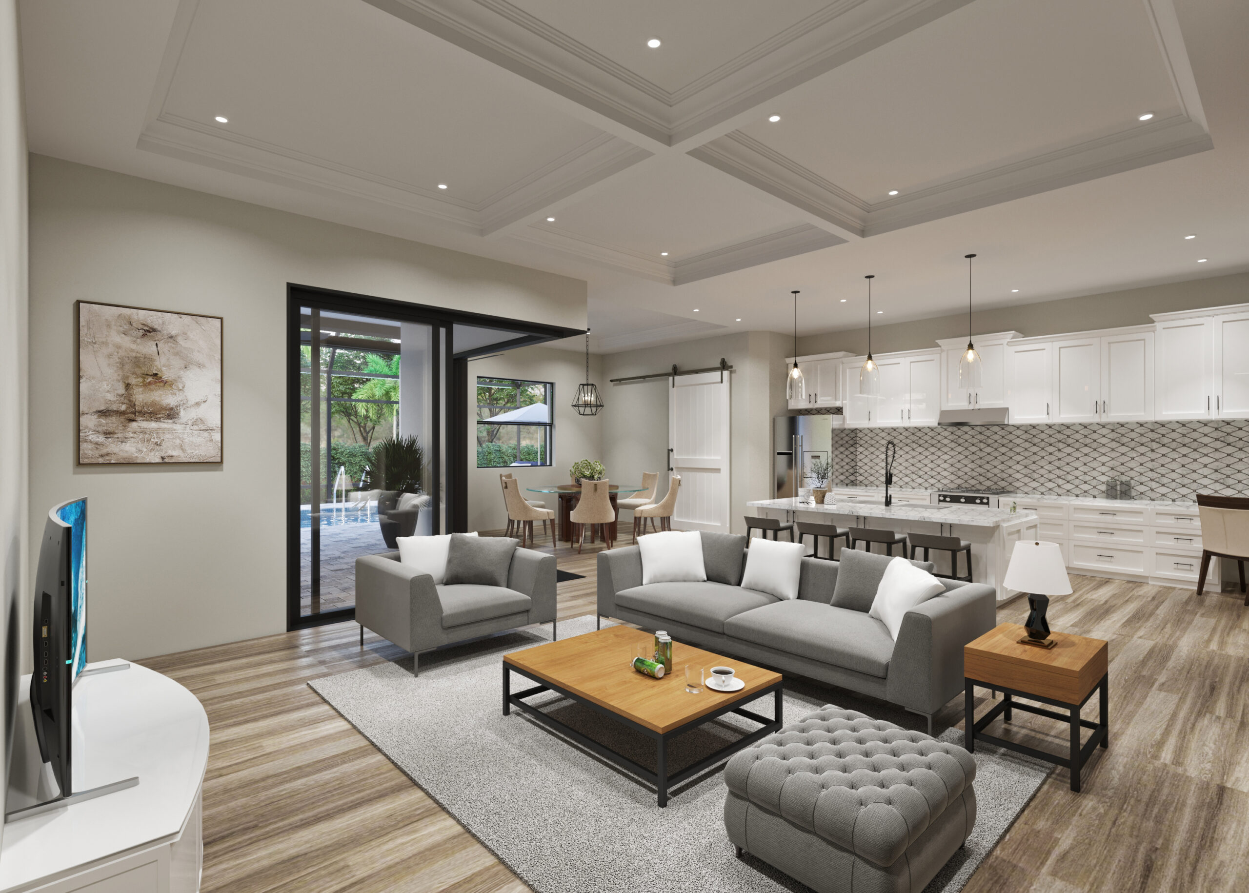
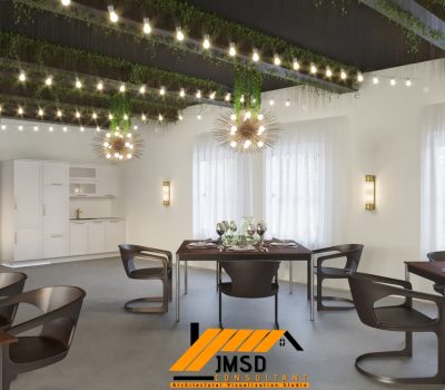
As a designer, you possess the ability to captivate clients with captivating visual materials showcasing the future project. Verbal descriptions alone may not suffice for clients who lack familiarity with design and architecture, making it challenging for them to comprehend drawings and sketches. To ensure a comprehensive understanding of the design, complement your drawings with three-dimensional architectural visualizations and virtual tours. By incorporating high-quality visuals, you can effectively stimulate the client’s imagination and effectively convey the design. Utilize 3D architectural visualizations, 360-degree views, walk and fly through videos to breathe life into your design. These immersive tools provide clients with a clear perception of the space, thereby amplifying the impact of your presentation.
Insufficient details
Design drawings and sketches alone may not provide the client with a complete understanding of the project’s extent. While visual materials offer a glimpse into the space and its functionality, it is crucial to supplement them with technical information. This ensures that the client possesses comprehensive data regarding the subject of their interest. By steering clear of these typical errors and employing impactful presentation strategies, interior designers can ensure that their projects resonate with clients and ultimately achieve the desired outcome.
The Ultimate Checklist: 5 Mistakes to Avoid in Interior Design Presentations
Overwhelming Visuals:
Look for a team that understands your vision and has a Strong 3D Architectural Visualization portfolio. While it’s essential to showcase your design ideas creatively, bombarding clients with too many visual elements can overwhelm them. Avoid cluttered presentations with too many patterns, textures, or colors. Opt for a clean and cohesive design presentation that highlights key features and concepts without causing sensory overload.
Ignoring Client Preferences
One of the biggest mistakes in interior design presentations is failing to consider the client’s tastes, preferences, and lifestyle. Make sure to thoroughly understand their needs and expectations before creating your design proposal. Incorporate elements that align with their style while also bringing fresh ideas and solutions to the table.
Lack of Cohesion
A cohesive presentation is crucial for conveying a unified design vision. Avoid inconsistencies in style, color schemes, or theme throughout your presentation. Ensure that every aspect of your design, from furniture selection to lighting choices, contributes to a harmonious and balanced overall look.
Neglecting Functionality
While aesthetics are essential in interior design, functionality should never be overlooked. Ensure that your design addresses the practical needs of the space, such as traffic flow, storage solutions, and ergonomic considerations. Incorporate functionality seamlessly into your presentation to demonstrate that your design is both beautiful and practical.
Poor Communication
Effective communication is key to a successful interior design presentation. Avoid using jargon or technical language that clients may not understand. Instead, use clear and concise language to explain your design concepts, materials, and ideas. Be open to feedback and encourage dialogue to ensure that the client feels heard and involved in the design process.
Conclusion:
By avoiding these common mistakes, you can create interior design presentations that are visually stunning, functional, and tailored to your client’s needs, ultimately leading to greater satisfaction and success in your projects.
Interior design presentations are of utmost importance in the field of interior design. A skillfully executed presentation has the potential to elevate a mediocre project to new heights, whereas a poorly executed one can spell disaster, regardless of the designer’s expertise and background. Continue reading to discover the five critical errors in design presentations that can undermine all the hard work.
So how do you like our Avoiding Common Mistakes in Interior Design Presentations article?
Contact us here for 3D Rendering and Animation Services now!? Reach us out with DM here on: | Get in touch email us at [email protected]


